
What Paint Trends Reveal About 2026 Design
What Paint Trends Reveal About 2026 Design

Every year, designers and homeowners wait for that Color of the Year reveal — but 2026 feels different.
This time, the hue itself tells a story about what we crave in our homes: warmth, grounding, and quiet sophistication.
Benjamin Moore’s 2026 Color of the Year, Silhouette (AF-655), is described as a “rich espresso hue with a hint of charcoal.”
It’s a far cry from the cool grays and crisp whites that once dominated our walls. Instead, it signals a return to depth — to homes that feel lived-in, layered, and luxuriously calm.
1. Ahead of the Curve: What Makes “Silhouette” So Special

Silhouette doesn’t just look beautiful — it behaves beautifully. It’s a color that reads differently in every light:
soft brown in the morning, moody charcoal at dusk. That adaptability is what makes it timeless.
Why it works:
- On exteriors: Silhouette adds gravitas — try it on a front door, window trim, or siding for a quietly elegant curb appeal.
- Indoors: It’s the perfect statement for built-ins, office walls, or kitchen islands where you want drama without darkness.
- In Nebraska’s light: It pairs effortlessly with warm wood tones, creamy whites, and natural stone — creating that cozy-modern balance Omaha homes are known for.
“Silhouette is proof that neutrals can have personality. It’s less about blending in and more about belonging.”
— Jenna Friesen, Co-Owner of Structur Design + Interiors
2. What the Trend Cycle Teaches Us (A Look Back at 2022)
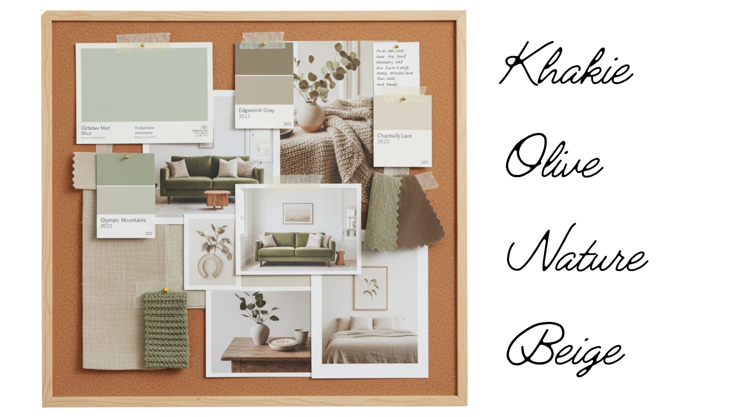
When we look back at the color picks of 2022, there’s a clear through-line: a slow, steady shift toward warmth. Brands predicted earthy greens, rich neutrals, and cozy midtones — and they were right.
That shift away from icy grays wasn’t just aesthetic; it reflected how people wanted to feel in their homes.
We craved balance, calm, and connection — emotions that still drive the 2026 palette today.
Then vs. Now:
- 2022: Olive greens and khaki tones rose in popularity for their connection to nature.
- 2026: Espresso browns and charcoal-infused neutrals are taking that grounding energy to the next level.
Lesson: Color trends may evolve, but the desire for comfort and authenticity never fades.
3. How to Use These Colors Like a Designer
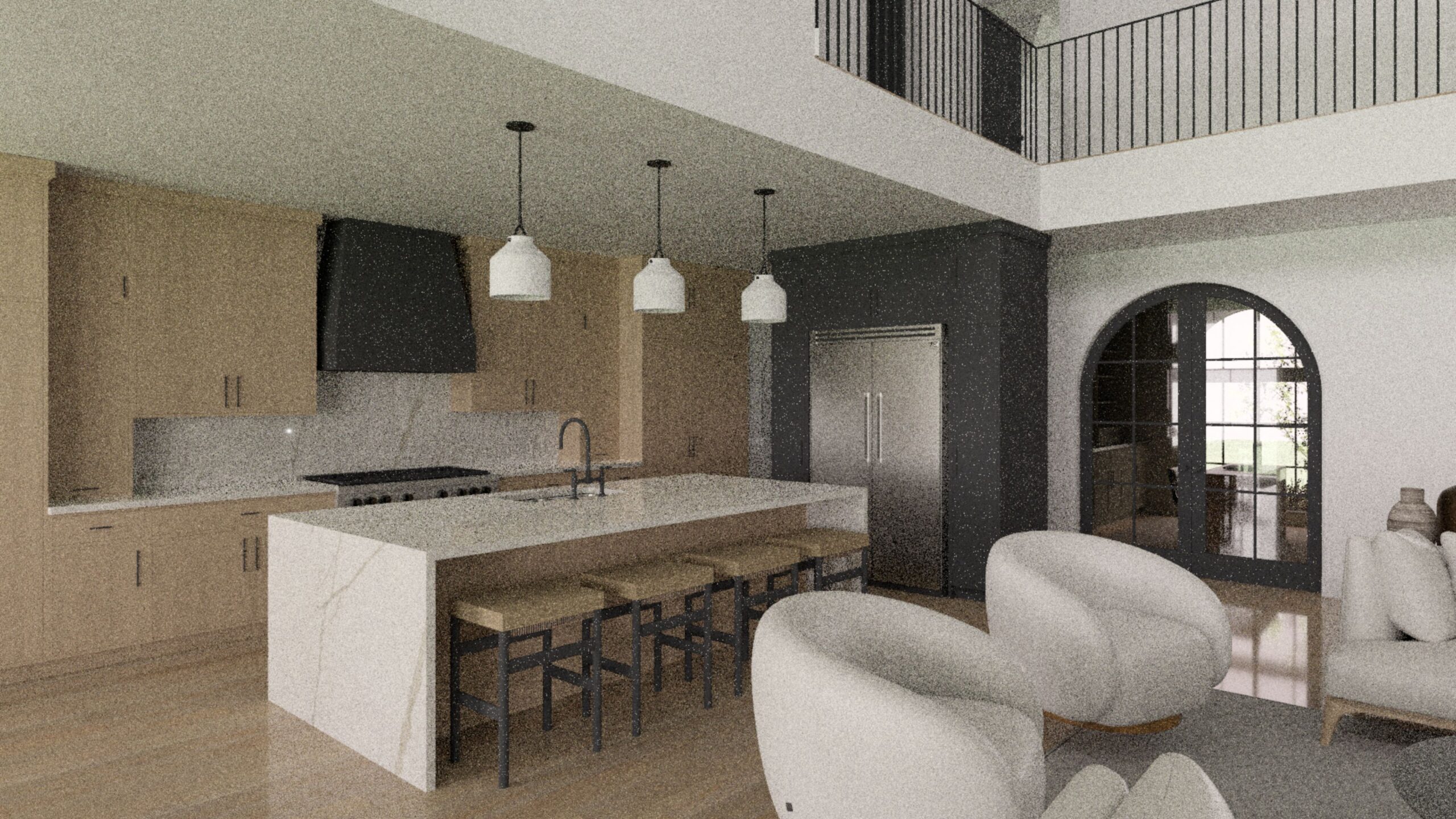
- Start with an Anchor Tone
Choose one hero color (like Silhouette) for a focal point — a fireplace wall, pantry cabinetry, or front door. Let lighter tones orbit around it for balance. - Layer Thoughtfully
Mix warm woods, textured fabrics, and layered neutrals. A palette of espresso, sand, and ivory feels elevated yet easy to live in. - Respect Natural Light
In the Midwest, daylight changes everything. Test colors at different times of day — what reads rich brown in morning light may lean dramatic charcoal by evening.
The Takeaway: Intentional Color, Enduring Design
Color isn’t just surface-level — it shapes the entire atmosphere of a home.
The 2026 color story proves that “neutral” doesn’t have to mean invisible; it can mean intentional, refined, and rooted in feeling.
By studying where we’ve been (2022’s warm neutrals) and where we’re going (2026’s moody sophistication), one truth stands out:
Design with intention always outlasts trends.
“Trends evolve, but good design always circles back to how you want to feel in your space.”
— Jenna Friesen
Ready to Refresh Your Palette?
Whether you’re updating one room or designing your dream home from the ground up, our team at Structur Design + Interiors can help you create a space that feels timeless, grounded, and uniquely yours.
FOLLOW US ON SOCIAL MEDIA

About Us
Structur is a full service residential design firm located in Elkhorn, NE. We specialize in creating stunning custom spaces, styling show-stopping decor, and finding hidden gems in the real estate world.


Recent Comments